2012 Washington Metro DC Chapter Contractor of the Year (CotY) Award from the National Association of the Remodeling Industry (NARI) for Best Kitchen
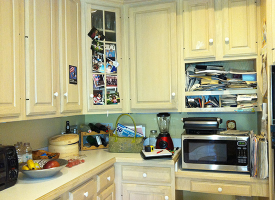
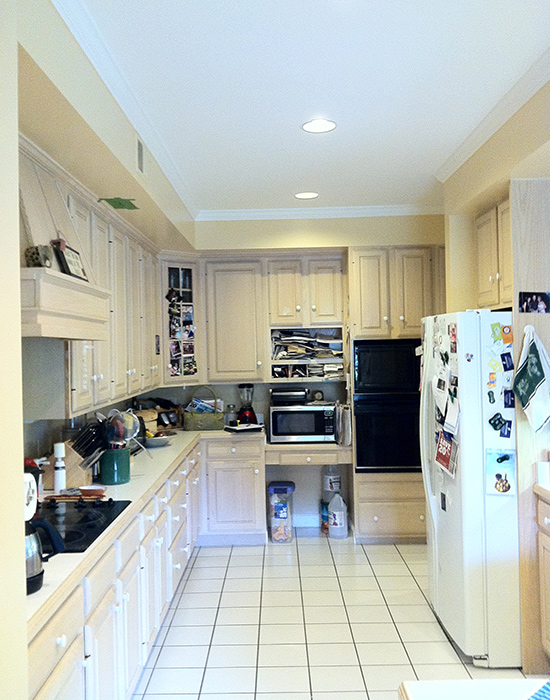
When we met this homeowner, she had designed a kitchen renovation with another designer. She said she just didn’t feel like the designer was really listening to her and was insisting on design elements that didn’t make sense. We were very glad to be able to help this homeowner, who loves to cook and bake, create her dream kitchen out of her outdated 1970s space.
Client needs:
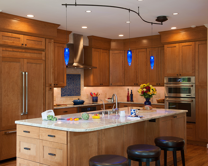
- Updated kitchen appearance – The kitchen was completed renovated using updated colors, styles, and finishes.
- Better appliances and more ovens – We added a range oven and two wall ovens (one microwave/oven combo).
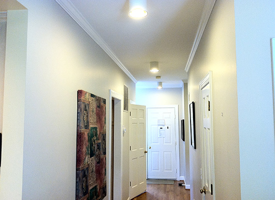
- Better circulation to family room – Removed the wall between the hallway and kitchen to make the kitchen space bigger and more open to the family room.
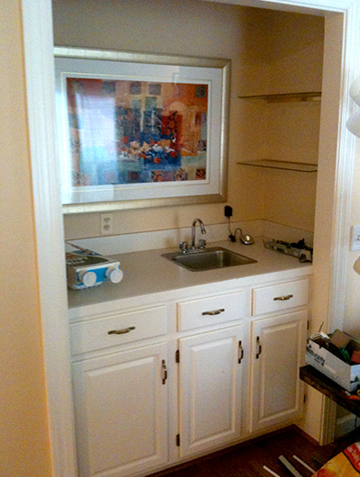
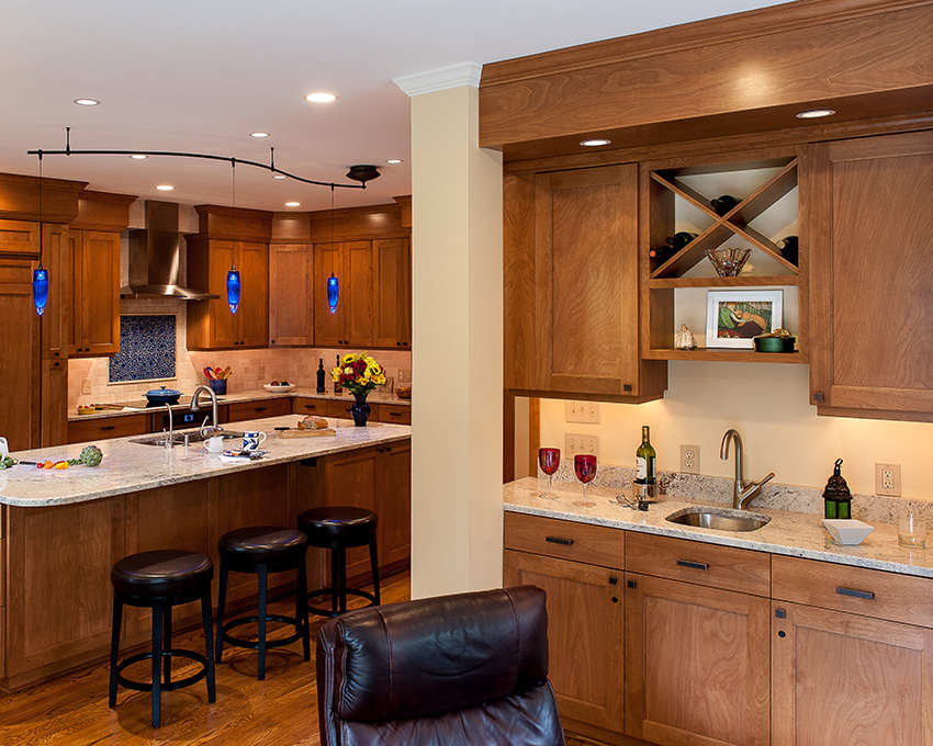
- New beverage center to divert guests out of the kitchen work space – Created a beverage center in the space that was previously a closet.
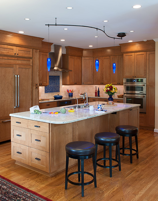
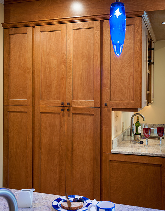
- More/better storage – Once the wall was removed, we had space to add a bank of floor to ceiling cabinetry. In addition, we tucked drawers and cabinets in every available space, like the kitchen island.
- More counter space for food prep and serving – The new island gives the client twice as much counter space as before.
- Casual eating area at the island – Created an island with seating space to accommodate three people.
The removal of the hallway wall in this kitchen made the whole living space so much more inviting. It is less crowded, has more cabinet storage, and work space. The new floor plan works really well in food prep, baking, serving and entertaining with adequate area for each of those functions.
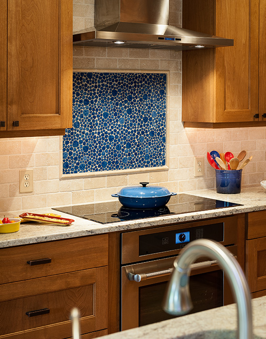
The new space is very aesthetically pleasing; not only with the new cabinets, lights and appliances, but also because the space can be more organized now that there is enough room for this chef’s kitchen items. By taking the wall down, we were able to run hard wood flooring into the kitchen so that the space became more seamless with the family room. Recessed panel red birch cabinets, with lots of wood graining, give the space interest without being overwhelming. The granite counter tops are very beautiful yet practical for this cook who even prepares her dog’s food from scratch. The back splash is a clean natural colored tumbled marble, but the focal point is a field of blue glazed ceramic “bubble” tile to bring a level of “dazzle” to the space; with matching blue pendant lights.
The client is thrilled with her new space and when we visited her recently with a gift basket, she was busy baking a large batch of cookies. She believes that the new kitchen has met all her needs and she is very glad that she met us and used our company to renovate her kitchen. We are very happy that she did as well.

