2013 Washington Metro DC Chapter Contractor of the Year (CotY) Award from the National Association of the Remodeling Industry (NARI) for Best Addition
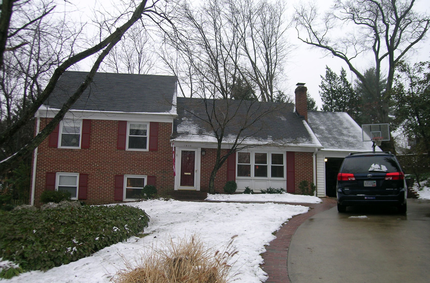
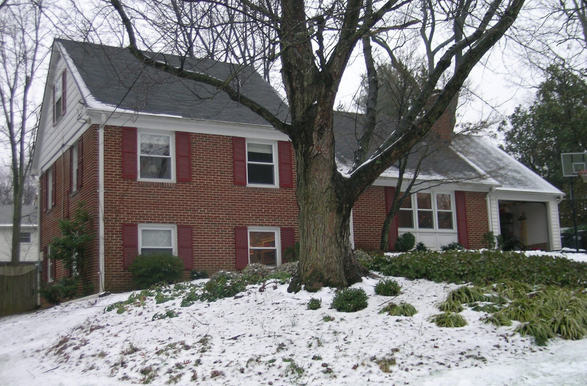
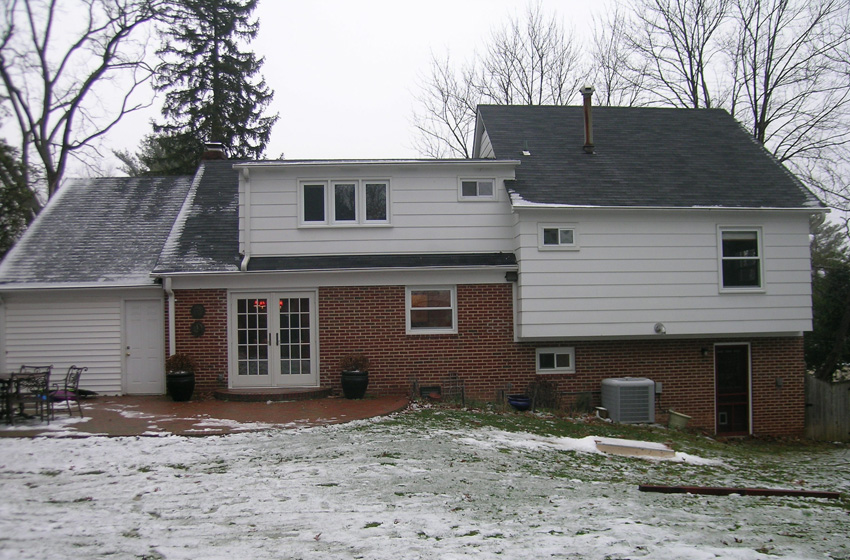
This home was formerly a 1960s split level home in McLean. While the homeowners had recently renovated their kitchen, the rest of the home lacked the space and amenities the clients wanted.
The scope of the work included:
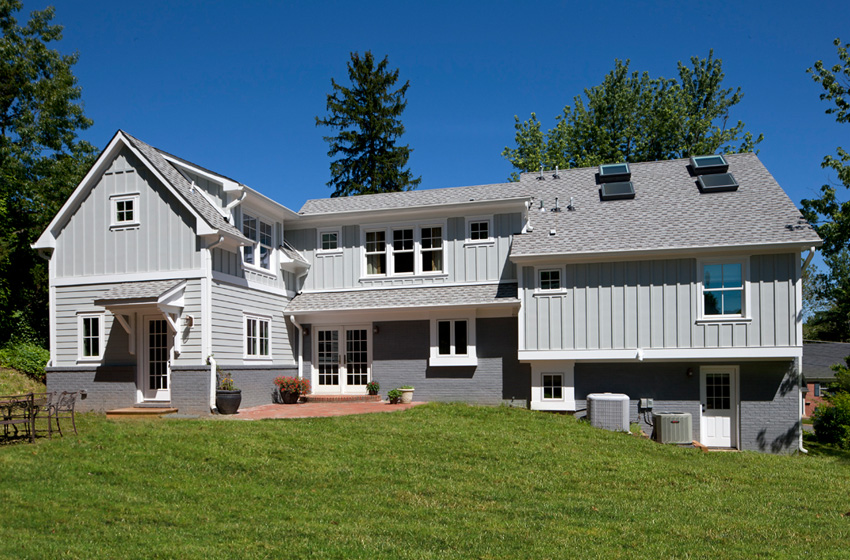
- Family Foyer, Mudroom; and Laundry Room Addition
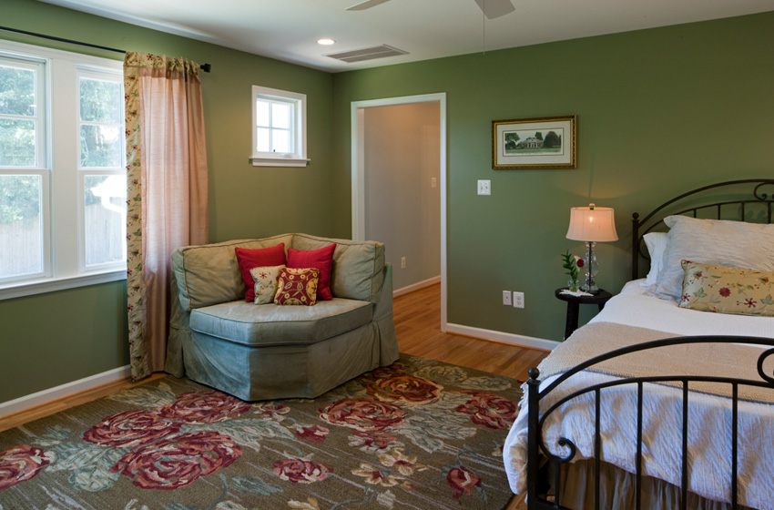
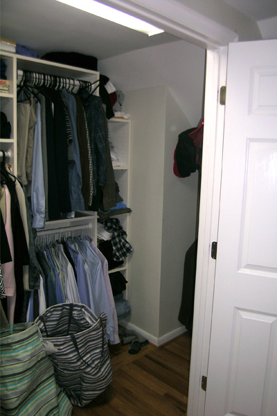
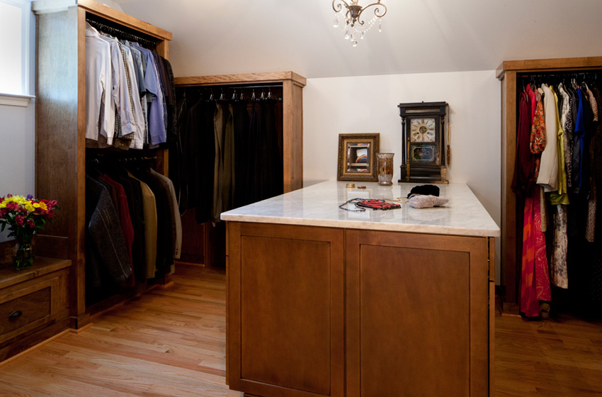
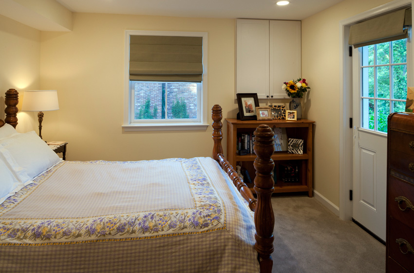
- Master Bedroom Suite Remodel including a new Bathroom and Walk In Closet Addition
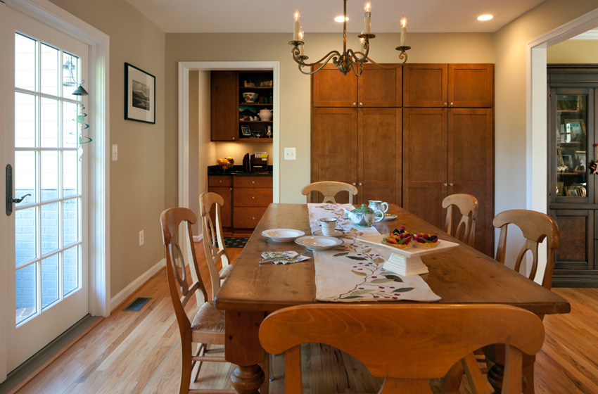
- Kitchen Pantry Cabinets and improved circulation to the new Family Foyer
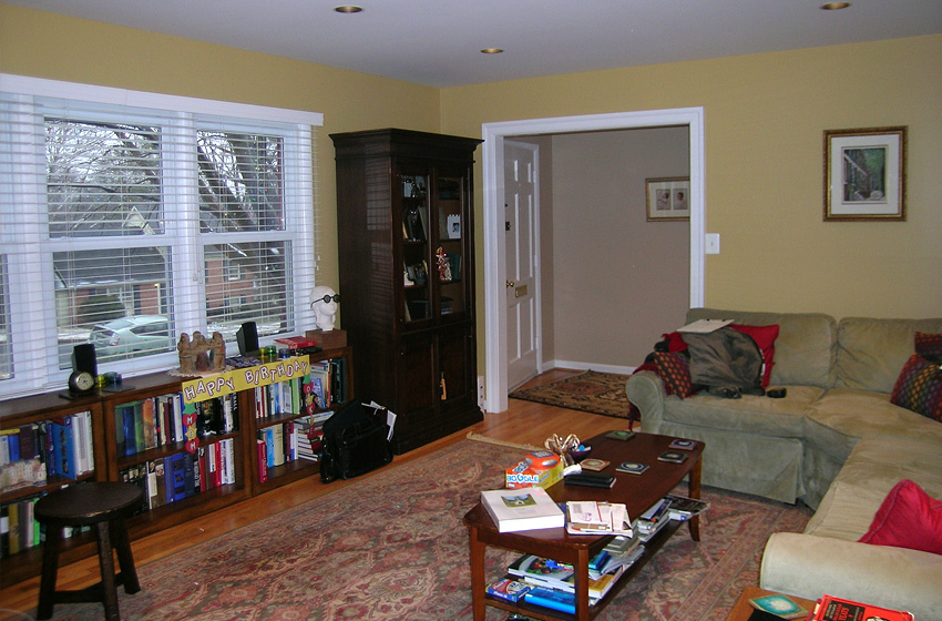
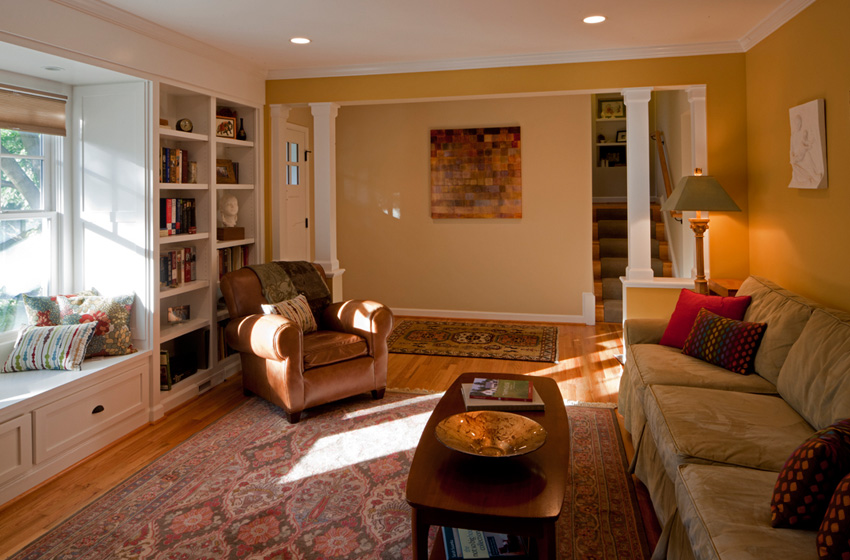
- Formal Foyer Remodeling including opening circulation to the Kitchen and Living Room; as well as, a new Entry Porch feature
- Boxed Window Bays (Bathroom, Kitchen, and Living Room)
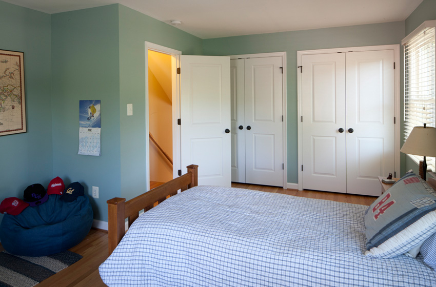
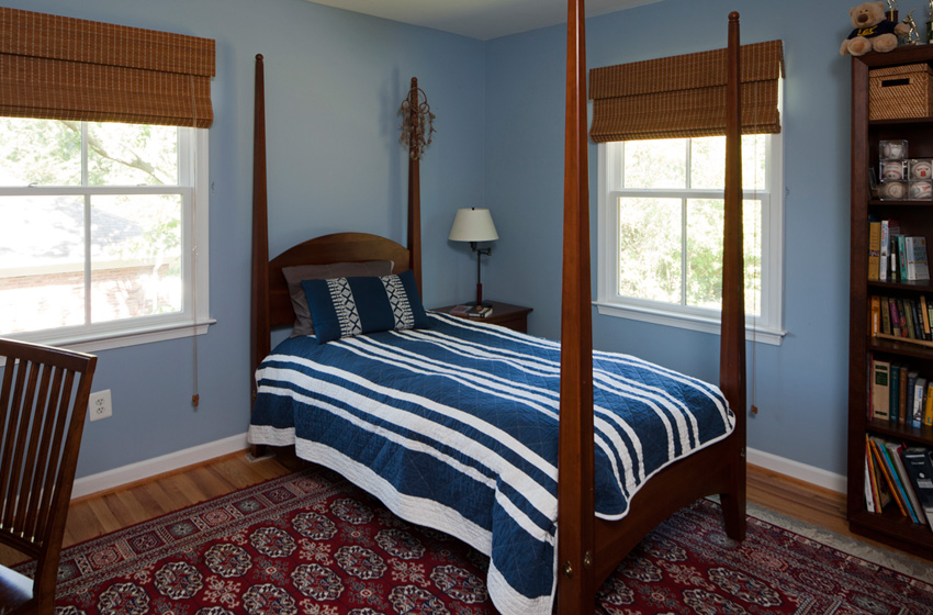
- Renovate Bedrooms #2 and #3 and relocate closets
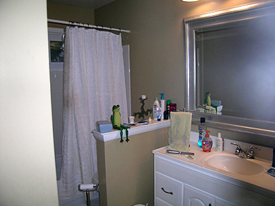
- Remodel all Bathrooms
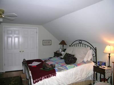
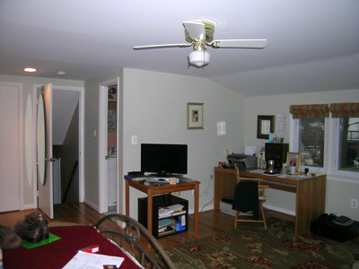
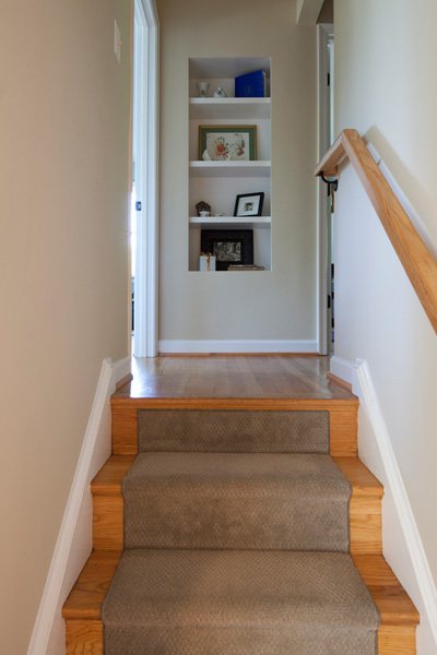
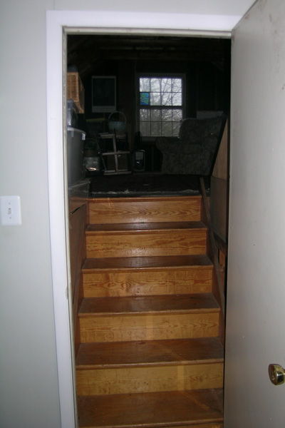
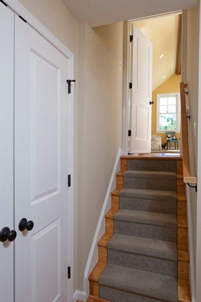
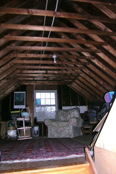
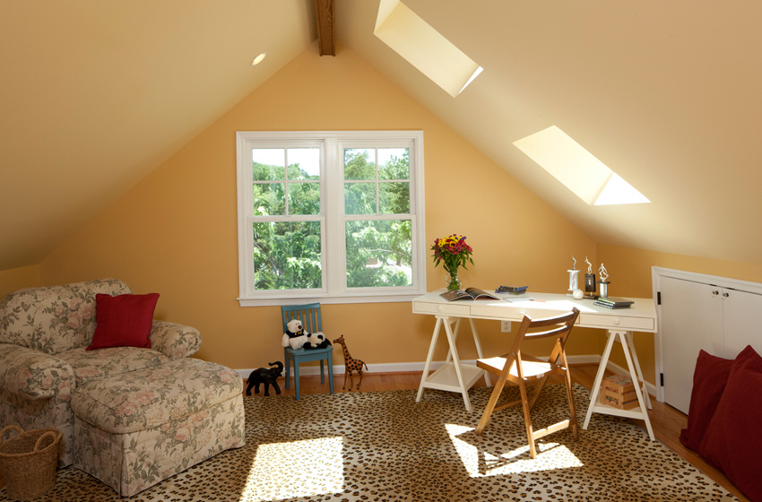
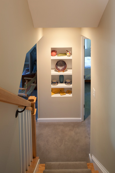
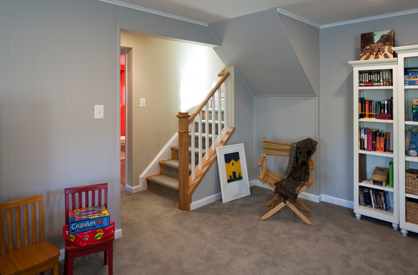
- Finish Bonus Room in Attic
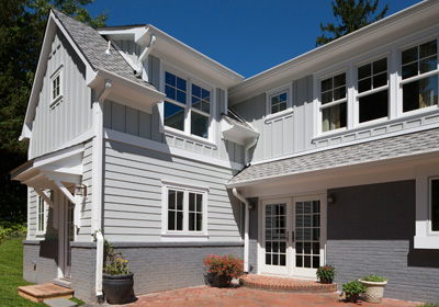
- Replace Roofing, Windows; and Paint Exterior
Here are the client’s stated needs and how we met them:
- Remodel and expand Master Suite:
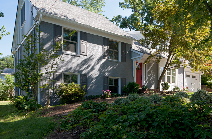
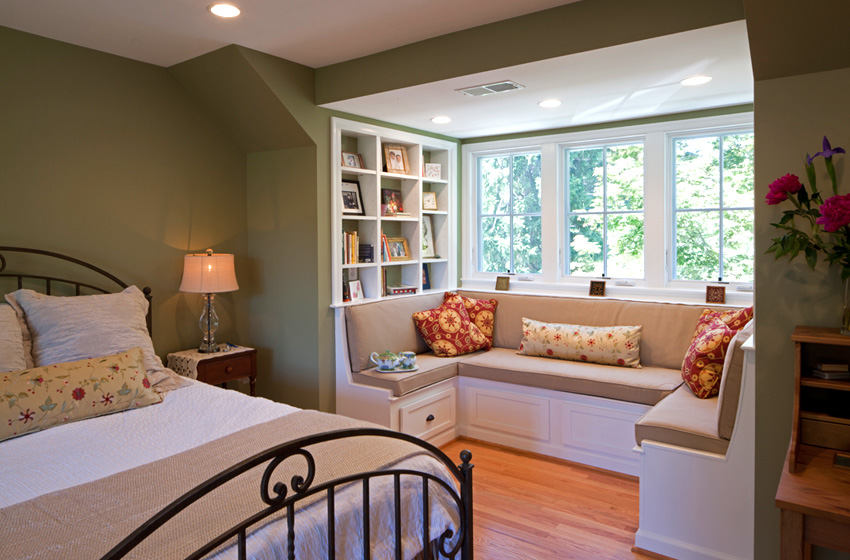
– Add Front Dormer with window seat
– Expand over Garage for a new Master Bathroom and walk-in-closet. - Create larger Bedroom for son: We combined two of the former smaller bedrooms to achieve this objective.
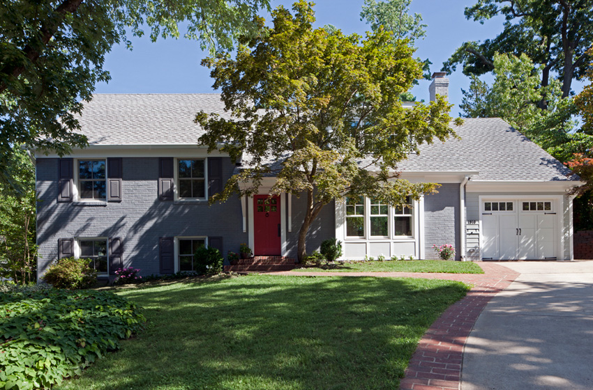
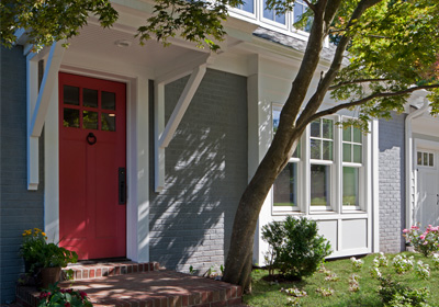
- Improve curb appeal:
– Front Door Entry Roof (provide guests protection), replaced door painted a burnt orange color for contrast
– Painted the brick a light gray and the shutters a darker gray - Improve venting and energy efficiency: We upgraded the HVAC system with new gas direct vent furnaces and high efficient air conditioners. Installed Spray foam insulation.
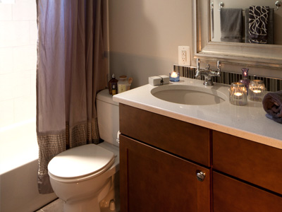
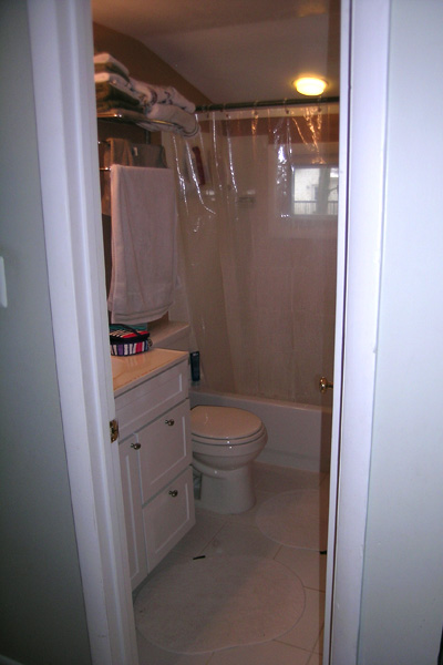
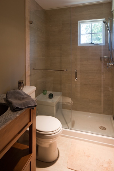
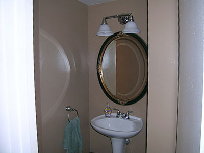
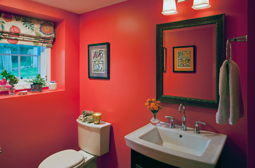
- Renovate bathrooms. We renovated all the bathrooms by replacing all the fixtures and flooring and giving them all a face lift with color and texture.
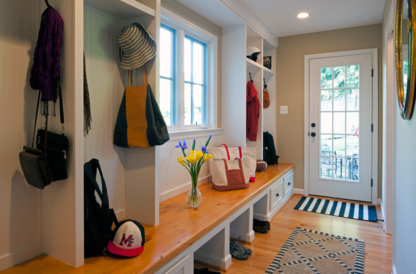
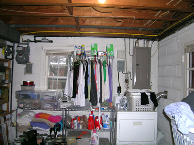
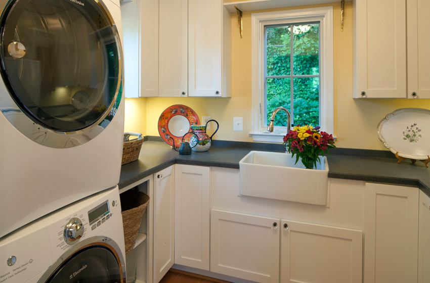
- Add Family Foyer including an Organization Center for client to drop off keys, mail, charging center for phones, calendar management. Mud room with cubbies, walk-in-closet; and a new first floor Laundry Room.
The structure has been significantly enhanced aesthetically. All the colors and every fixture, inside and outside the home, have been updated. The use of multiple roofs lines and the addition of the board and batten siding provided the “craftsman/cottage look” the client requested. The well thought out reconfiguration of the existing interior space has improved the appearance of this home. The added space is light filled, spacious and well organized.
The renovation of the other Bathrooms has created more cabinet space, shower benches, and energy efficient plumbing.
The array of products used throughout the home, are both practical and attractive. To name a few:
- We used wood grain porcelain in the renovated existing bathroom. It is non-slip and cost effective.
- In the children’s bathroom, we used Cambria, man-made counter tops, because they are stain resistant.
- We installed an integrated shower base with bench in the hall bathroom where an old tub had existed.
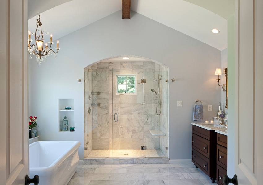
- In the master bathroom, the client wanted it to look like an old-world hotel (like some they’d stayed in around the world). So, we used all marble flooring, an affordable acrylic tub that has the look of real china, a crystal chandelier and polished chrome fixtures; and arched top shower with a “floating” stone seat.
- The job built master closet shelving, master bedroom seating area and rolling linen closet hiding the secret closet are all examples of our master carpenter’s wood working prowess.
The project looks great, has increased functionality and helped the client achieve all their objectives for this new space. In the end, the client said she loved her new home and that the home felt like a big cozy blanket wrapped around her! That is exactly the affect we wanted.

